Product Designer 2024 Web, mobile-first
Redesigning the Receitas Nestlé sign-up journey.
A year of shipped improvements from an inherited funnel diagnosis, measured year over year against a rebuilt baseline.
- product-design
- funnel-optimisation
Context
- Product: Receitas Nestlé, Nestlé Brazil’s recipe platform: recipes, free e-books, cooking courses, a weekly menu planner. Mobile-first, at national scale.
- Business goal: grow registrations and logins to power retention through the logged-in area.
- The starting point: a data + UX diagnosis (GA funnels + Clarity heatmaps) delivered in late 2023 had mapped the problems and prioritized opportunities on an effort x impact matrix.
- My entry: I joined as Product Designer in the Consumer team at Produtos Digitais when the original designer moved to another project, inheriting the diagnosis with the implementation still ahead.
- Timeframe: phased deliveries Apr–Sep 2024, results analysis Nov 2024.
My role
After the diagnostic phase, I became the designer on the project, taking over from a colleague. My work covered the redesigned pages (home, e-books, courses, recipe, sign-up and OTP flows), in phased deliveries with the Receitas team and business unit. When the releases were out, I ran the results analysis: pulling the data from GA and Clarity, building a proxy to compare across the GA4 migration, and presenting the findings to the business team.
The problem
The diagnosis was clear about where sign-up intent lived and why it was leaking:
- Most sign-up traffic came from one place, the recipe e-books section, yet a large share of users dropped off right after being redirected to the form.
- Users hit a demanding registration form with no explanation of value (“high complexity, low perceived value” was the verdict), including a password requirement that measurably confused people.
- Heatmaps showed pages competing with their own purpose: a split menu capturing a small fraction of interactions, a fixed banner covering content while earning almost no clicks against the volume it was served to, and dead clicks documented across the key funnel pages.
The diagnosis wasn’t mine; the work from there was.
Process & key decisions
Decision 1: Map findings to deliverables. I started by working through the diagnosis page by page (each had a defined function, opportunities, and success metric) and delivered the redesigns through the project’s phased roadmap: header/menu, then home + cards + e-book pages, then courses, sign-up page, internal linking, and OTP. Every release stayed measurable.
Key decision
Decision 2: Surface the books; accept the exit-rate hit.
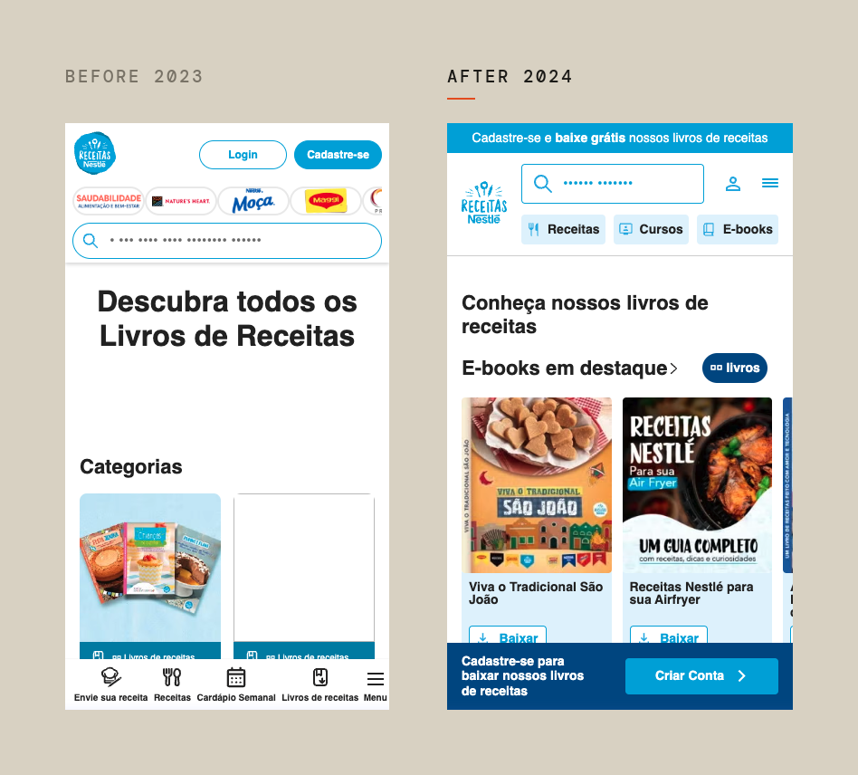
The e-books page, the funnel’s most valuable source of intent, made users click through categories before seeing a single book. The redesign presented books directly with clear download CTAs. In the results, that page’s desktop exit rate worsened: users no longer browsed into categories. Investigating it, we confirmed the hypothesis. We had traded navigation depth for conversion intent, and sign-up intent from that page grew several times over on mobile. The metric that mattered won.
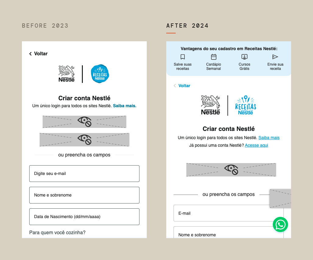
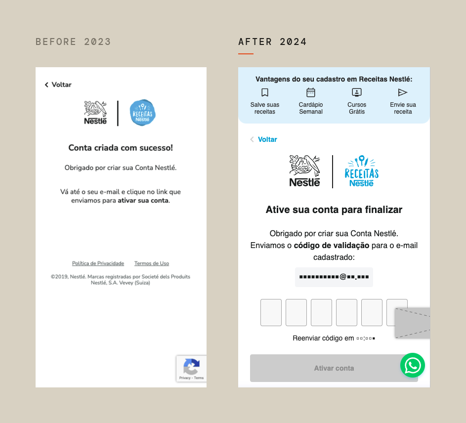
Decision 3: Show value before asking for effort. The sign-up flow got a benefits banner and a clearer form, sign-up triggers were relocated to each page’s hottest areas, and an OTP code replaced email-link activation. Account activation improved from its first month.
Decision 4: Rebuild the baseline when the tools change. I ran the year-over-year analysis, pulling the data from GA and Clarity. Mid-project, the GA4 migration and a new cookie banner had broken comparability of absolute numbers. Absolute figures were no longer comparable, so I built a proxy: a rebuilt 2023 baseline, compared against the same 2024 period using conversion rates. Where results puzzled me, like a 2023 sign-up spike from the courses page with no identifiable trigger, I flagged it for deeper investigation. I presented the analysis to the business team.
The solution
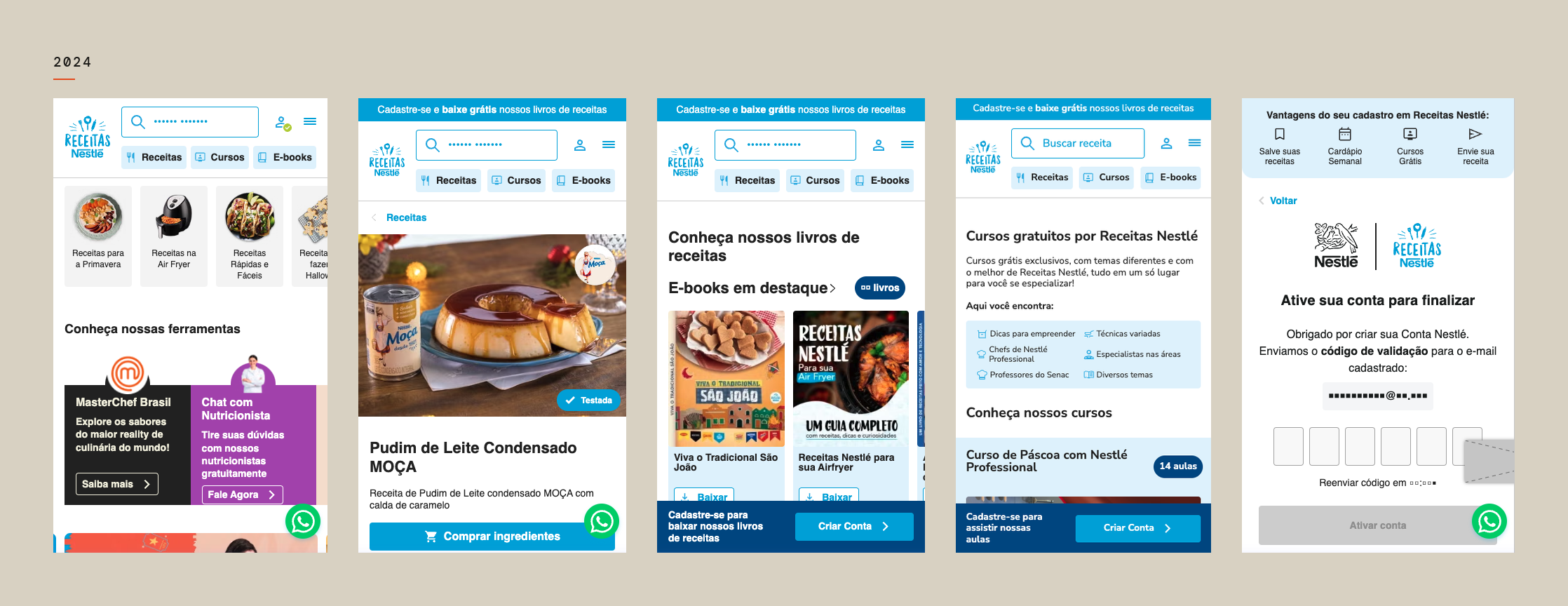
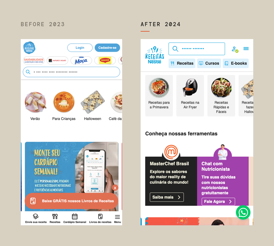
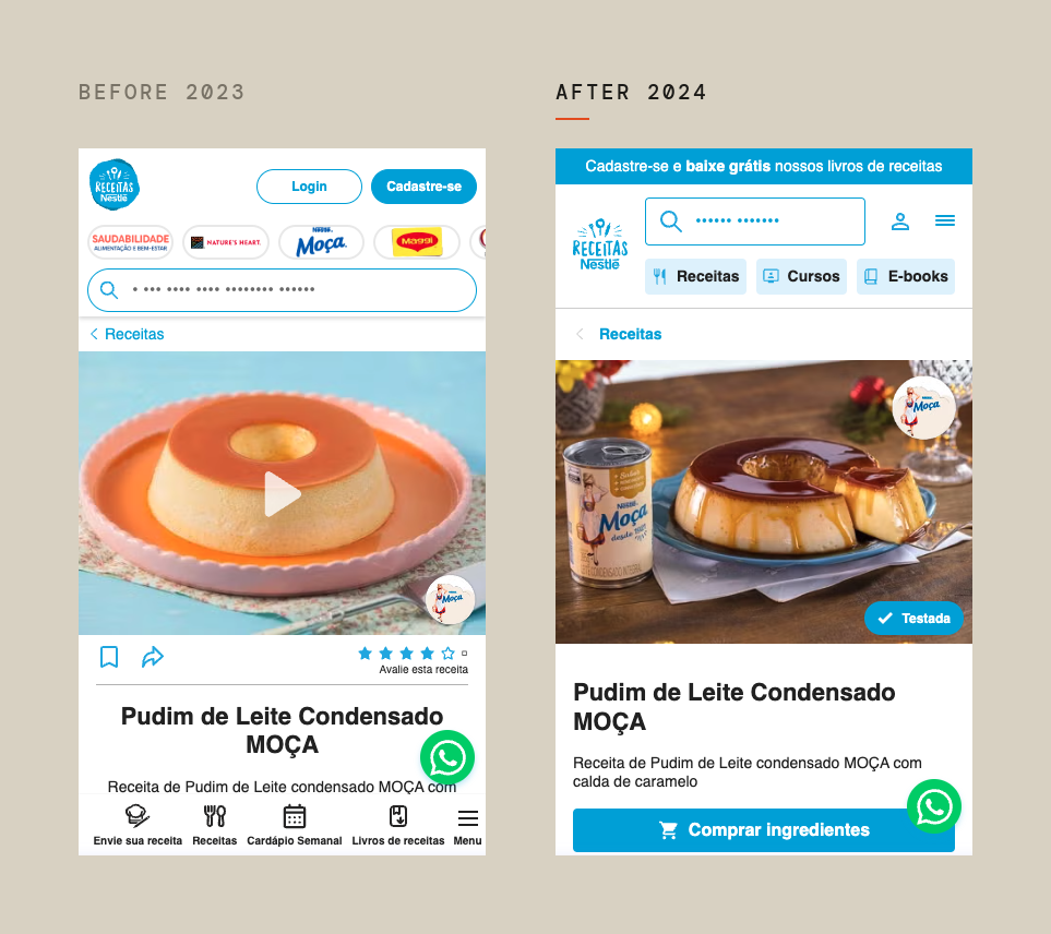
Curated before/after pairs: home (menu consolidated, tools in the first fold), e-books (books surfaced + sign-up CTA), recipe page (breadcrumb, “Tested” badge, cleaner action bar), sign-up (benefits banner, clearer form, OTP).
Mobile home
Recipe page
E-books
Sign-up
Activation
Impact
Year over year, same two-month period, 2023 against 2024, compared in conversion rates rather than absolute numbers:
- Home exit rate fell by roughly half on mobile, and by about a third on desktop.
- Exit rates improved on nearly every key page, with the weekly menu and the courses page showing the largest gains on mobile.
- Sign-up intent multiplied from the trigger pages, most of all from e-books on mobile, then recipes on desktop and the weekly menu.
- Navigation from the new header to the pages it promoted rose substantially on mobile.
- Engagement rose across every device, in both time per user and engaged sessions.
- OTP lifted completed account activations in its first month.
Learnings
This was my first large project after transitioning from visual design into product design, and it’s where the role truly clicked. I learned to work from data rather than toward aesthetics: pulling and reading the funnels and heatmaps, designing against a metric, negotiating scope with a business unit, and rebuilding the measurement baseline when the tools changed underneath me. My visual background didn’t disappear; it became the execution layer under decisions I could now defend with evidence.